Central Accessibility · Apr 2026 · Meta
Accessibility User Research & Compliance for Screen Readers
Establishing canonical labeling principles through SME workshops and a qualitative study with iOS VoiceOver users.
Role: UX Research & Content Design · Method: SME alignment workshop + qualitative study with iOS VoiceOver users
[ Hero image placeholder — deck cover / title visual ]
Overview
Screen reader users kept telling us the same thing: our accessibility (AX) labels were accurate, but the overall experience felt overly verbose. At the same time, the teams responsible for those labels couldn’t agree on when a label needed extra context — a disagreement that was quietly generating rework across manual accessibility (MVA) reviews, QA / content-design / engineering remediation, and AI-generated labels.
This project set out to resolve that ambiguity: align internal experts on a shared set of labeling principles, validate those principles with real screen reader users, and turn the result into canonical guidance that could serve as ground truth for humans and AI alike.
My role: UX Researcher and Content Design partner — designing the study, running the SME alignment workshop, partnering with the AnswerLab vendor team on the qualitative study, and translating findings into the canonical principles and decision tree.
Problem
Three interconnected problems, one root cause
Three different workstreams were all being slowed by the same underlying issue — no canonical guidance on when an AX label needs added context.
1. MVA reviews — Reviewers applied inconsistent pass/fail judgments, producing missed detections and false positives that had to be escalated to content design and subject-matter experts (SMEs) for arbitration.
2. QA / CD / Eng remediation — Without shared ground truth, fixes conflicted with one another and generated avoidable rework.
3. AI detection & remediation — The AX Fixer Bot scaled detection, but AI-generated labels had no ground-truth reference to be measured against.
All three pointed to the same need: canonical AX label guidance.
Why guidance currently contradicts itself
MVA platform split. Web review was graded against MVA 2.4.4 (WCAG Level A, which lets surrounding context inform link purpose); mobile was graded against MVA 2.4.9 (WCAG Level AAA, which requires the link text alone to convey purpose). The two heuristics were applied differently across surfaces and not transparently communicated.
Risk requirement RQ10925585 added an “isolation” bar that conflicted with the Level A interpretation.
CD AX leads diverged. Some leaned toward the 2.4.4 Level A reading — if the surrounding UI already provides context, no extra label is needed — but the absence of concrete, shared examples kept the team misaligned.
The people problem: verbosity is the #1 screen reader pain point
Verbosity surfaced as the most consistent complaint across a body of prior research: the NFB × Meta study (Oct–Nov 2024), an Instagram AX expert review (May 2024), blind and low-vision co-design in Paris (Jun 2025, 12 users), WhatsApp BLV UXR (Sep 2025), WhatsApp Web Eng (Jul 2023), and FB Web Feed analysis (Mar 2026).
40%
of all open MVA blockers were label issues. The AX Fixer Bot had scaled detection, but AI-written labels still needed a ground-truth standard to be trusted.
Research
Two phases: align, then validate
Phase 1 — SME alignment workshop. Seven SMEs worked through eight real labeling scenarios in a 25-minute-per-scenario format. Outcome: four scenarios reached alignment; four were flagged as genuinely contested and sent to user research.
Phase 2 — Qualitative UXR. Twelve iOS VoiceOver users (5 female / 7 male, US + UK), remote 60-minute in-depth interviews, evaluating web prototypes that simulated iOS app flows. Label variants were counterbalanced using a Latin-square design. Fieldwork ran Mar 18–23, 2026, with vendor AnswerLab.
Limitations: small qualitative sample; iOS VoiceOver only; US / UK only; web prototypes rather than native apps; findings are directional, not statistical.
Phase 1 outcome: 8 scenarios → 4 aligned, 4 sent to UXR
ALIGNED IN THE WORKSHOP
Word order — Action + Name
Modifiers — omit when context is clear
Back button — “Back to [context]”
“See more” — placed after truncated text
SENT TO UXR (UNRESOLVED)
“OK” family / multiple dismiss controls
“Learn more” links
Selectable category value (e.g. “Only me”)
“More options” kebab
Findings
RESEARCH QUESTION 1 · CLARITY & BREVITY
What screen reader users expect from clarity and brevity
“What are screen reader users’ expectations regarding the clarity and brevity of AX labels in different UI contexts?”
FINDING 1.1
Element role was treated as table stakes
→ Make element roles (button, link) explicit on every interactive control.
FINDING 1.2
Brevity vs. clarity depended on experience and familiarity
→ Default to brevity for familiar, low-stakes elements; add context via optional mechanisms (hints).
FINDING 1.3
High-stakes contexts called for clarity regardless of experience
→ Use explicit, descriptive labels for privacy, consent, payments, and irreversible actions.
FINDING 1.4
Some participants expected labels to predict outcomes
→ Use outcome-predictive labels — “Return to message,” not “Close.”
FINDING 1.5
Natural language was preferred over platform jargon
→ Favor natural language — “who can see,” not “privacy audience.”
RESEARCH QUESTION 2 · INFERRED CONTEXT
How well users infer context from the flow itself
“How well do screen reader users infer contextual information while navigating product flows — and how does that inferred context affect their preference for label verbosity?”
FINDING 2.1
Some participants were highly adept at inferring context from swipe order
→ When swipe order establishes clear context, keep labels brief.
FINDING 2.2
Context recovery was straightforward, even when lost
→ Don’t assume non-linear navigation requires verbose labels.
FINDING 2.3
Context sufficiency depended on UI structure
→ With multiple identical elements, add the entity name; with no surrounding context, add explicit context.
KEY FINDING · THE BRIDGE
2.4 — VoiceOver hints bridged the gap between brevity and clarity
Hints satisfied both experienced and less-experienced participants at once: the primary label stayed concise, while the hint delivered detail read only after a pause — and only if the participant had hints enabled. Experienced participants typically disabled hints to move faster; less-experienced participants kept them on as a learning aid.
“The hints are considered like training wheels when you learn how to ride a bike or something like that.” — P9
“It tells me what the disclosure is and what the button does… if you’re not really used to screen readers, I think this would be really good.” — P8
“I have hints turned off, so it doesn’t bother me.” — P10 (experienced — hints added no friction)
Recommendation: use hints as the scalable mechanism for the brevity-vs-clarity tension. Keep primary labels concise; place detailed explanatory text in hints — serving both audiences simultaneously.
Principles
RESEARCH QUESTION 3 · CANONICAL GROUND TRUTH
“What labeling principles align with user expectations and can serve as ground truth for canonical guidance?” The seven principles below each carry do / don’t examples and the scenario that sourced them.
PRINCIPLE 1 OF 7
Make element roles explicit
All interactive elements must expose their role (button, link, checkbox, etc.) to assistive technology. Role clarity is the foundation of accessible labeling — without it, no amount of label wording can compensate.
✓ “Learn more” [announced as Button]
✗ “Learn more” (no role announced)
Source: UXR Scenario 1 · V4 vs. V1
PRINCIPLE 2 OF 7
Default to brevity; rely on surrounding context
When surrounding text, headings, or swipe order already establish context, keep labels brief. Don’t repeat information the user has already encountered.
✓ “View” (toast already says “Post published”)
✗ “View published post” (modifier repeats known context)
Source: SME Scenario 3 · Modifiers
✓ “More options” (placed after username in swipe order)
✗ “More options for [Username]” (repeats context)
Source: UXR Scenario 2 · V1 vs. V3
✓ “See more” (in same tap target as truncated text)
✗ “See more about this post by [user]” (over-specified)
Source: SME Scenario 6 · See more
PRINCIPLE 3 OF 7
Use “Action + Name” word order
When a CTA is associated with a named entity, use “Action + Name.” Omit the entity type unless multiple entity types share the same name and CTA.
✓ “Follow Kylie Jenner”
✗ “Follow suggestion, Kylie Jenner” (entity type adds jargon)
Source: SME Scenario 2 · Word Order
✓ “Add Eddie Zhang”
✗ “Add recipient, Eddie Zhang” (entity type is redundant)
Source: SME Scenario 2 · Word Order
PRINCIPLE 4 OF 7
Use VoiceOver hints to bridge novice–expert needs
Hints should be used rarely — consistent with existing CD guidance. The primary trigger is when behavior isn’t immediately clear from the label alone (e.g. a “More options” kebab where the double-tap action is unclear). Hints serve experienced users (who disable them) and novices (who keep them on) simultaneously.
✓ Label: “More options” / Hint: “Double-tap for more options for [Username]”
✗ “More options for [Username]” (forces verbosity on everyone)
Source: UXR Scenario 2 · V1 + hint pattern
PRINCIPLE 5 OF 7
Prioritize clarity for high-stakes actions
For actions involving privacy, security, consent, or payments, always use explicit labels that state the purpose. This overrides brevity-by-default — clarity takes priority regardless of experience level.
✓ “Acknowledge privacy disclosure” (privacy / consent)
✗ “OK” (acknowledge? close? confirm?)
Source: UXR Scenario 3 · V3 vs. SME Scenario 1
✓ “Confirm payment of $49.99” (financial)
✗ “Continue” (to where? doing what?)
Source: General principle
✓ “Delete account permanently” (irreversible)
✗ “Yes” (yes to what?)
Source: General principle
PRINCIPLE 6 OF 7
Use outcome-predictive labels
Labels should state what happens on activation. Replace vague actions with specific outcomes so screen reader users know where an action will take them before they activate it.
✓ “Return to message” (states destination)
✗ “Close” (close what? go where?)
Source: UXR Scenario 3 · V1
✓ “Back to sharing options” (states destination)
✗ “Back” (back to where?)
Source: SME Scenario 4 · Back
PRINCIPLE 7 OF 7
Use natural language over jargon
When labels describe settings or states, use conversational phrasing that mirrors how users naturally think about the setting, rather than platform-specific terminology that requires extra cognitive decoding.
✓ “Only me, who can see your social links”
✗ “Only me, privacy audience for social links”
Source: UXR Scenario 4 · V4 vs. V2
How to apply: the decision tree
A single decision flow operationalizes all seven principles. Start at any interactive element and work down: fix the role first, branch on stakes, then decide how much context the label needs.
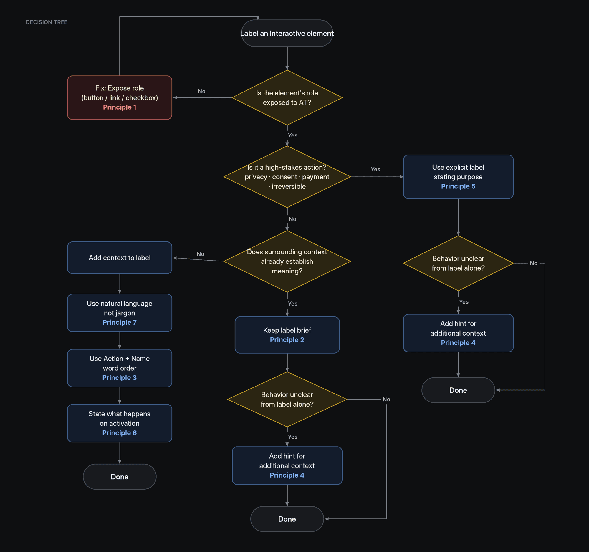
1. Is the element’s role exposed to AT? No → expose role (Principle 1).
2. Is it a high-stakes action (privacy · consent · payment · irreversible)? Yes → explicit label stating purpose (Principle 5).
3. Does surrounding context already establish meaning? Yes → keep label brief (Principle 2); if behavior is unclear, add a hint (Principle 4).
No → add context: natural language, not jargon (7) → Action + Name word order (3) → state what happens on activation (6); if still unclear, add a hint (4).
Recommendation
Unify MVA label evaluation under WCAG 2.4.4
WHY MOVE OFF 2.4.9 FOR MOBILE
2.4.9 is Level AAA — it exceeds Meta’s AA target.
The accessibility tree, focus groups, and headings are programmatically determinable on mobile too.
UXR confirmed users reliably infer purpose from swipe order.
WHAT UNIFICATION GIVES US
One standard across web and mobile.
Resolves the contradiction with RQ10925585’s “isolation” bar.
The 7 principles supply the case-by-case judgment 2.4.4 requires — brevity by default without compromising clarity where it matters.
This does not mean labels can be vague. When context is insufficient, explicit labels are still required — Principles 5 and 7 govern that judgment.
Next steps
In flight across CAX, CD, MVA, and AI
WORKSTREAM 1
XFN alignment on canonical guidance
WORKSTREAM 2
Risk requirement RQ10925585 update
WORKSTREAM 3
MVA heuristics unified across platforms
WORKSTREAM 4
AI Label Control spec for the AX Fixer Bot
WORKSTREAM 5
CD Portal + AX Training updates
WORKSTREAM 6
CAX knowledge base for AI models
WORKSTREAM 7
Detection / remediation evaluation
Anticipated impact
Reduce avoidable MVA issues related to AX labels by folding the new guidance and ground-truth examples into: MVA heuristics and reviewer training; the AI AX-label generation tool; automated AX detection & remediation; the AX Label Guidance on the CD Portal; CD AX training (course + onboarding); and Accessibility Guidance.
APPENDIX · STUDY STIMULI (image placeholders)
The study tested these label variant sets across Instagram, Facebook, and WhatsApp flows — screenshots to capture later:
WhatsApp — “Learn more” link on the end-to-end-encryption / chat-info disclosure. V1 “Learn more” / V2 “Learn more about end-to-end encrypted messages” / V3 label-only.
Instagram — “More options” kebab on a profile / following-list row. V1 “More options” / V2 “for [entity]” / V3 “for [entity name].”
WhatsApp — “Acknowledge” CTA on the business-chats privacy-disclosure sheet. Five grabber / close-button / label variants + activity-hint stress test.
Instagram / Facebook — “Only me” audience selector for profile social links (Accounts Center). V1 “Only me” / V2 “+ privacy audience” / V3 “+ for social links” / V4 “Only me, social links.”
Also referenced (SME workshop scenarios): Instagram follow suggestions (“Follow Kylie Jenner”), Messenger add-recipient (“Add Eddie Zhang”), Facebook feed “See more,” and Instagram / Facebook Stories “Made with AI.”
Still to source: title / hero visual, deck cover, and stimulus screenshots for each variant set above.