Role
Product Designer and Content Designer
Team
Product Design, Content, Engineering, PM
Timeframe
1 year
Company
Meta

Overview
A large and growing set of people live almost entirely inside Instagram and rarely open Facebook. That meant Marketplace, Groups and Friends & Family — some of Facebook’s most-loved surfaces — were effectively invisible to them, and Meta was leaving engagement and commerce on the table inside its own portfolio. Instead of asking Instagram users to go find these Facebook experiences, I brought a curated preview of them to the user, natively formatted for the surface they were already on.
The objective was concrete: a first-half target of 2 million monthly active people from the US pilot. My scope was the ad units and the system behind them — eight unit types across feed, Stories, notifications and landing pages, plus the tokens, components and governance rules that let partner teams ship new units without me. I owned the unit design, the content strategy, and the system rules.
The design challenge was one tension I had to hold. Each unit had to feel native and desirable inside Instagram while still driving a clear cross-app action back to Facebook. Lean too native and the unit misleads someone about where the content actually lives; lean too branded and it reads as an ad and gets scrolled past. I also designed inside brand and legal review that required Facebook to be named in every single unit, which closed off the easiest route to native and forced the system to earn attention another way.
Cross-App Design System
Every unit in this system is built from the same small set of parts. One source header, one card, one CTA, one set of tokens, recombined per surface. That is what let it scale past my own team: a partner could ship a new unit without redrawing it, because the parts and the rules already existed.
A note on this artifact: the original system lived in a published Figma library at Meta, which I could not take with me. What follows is a recreation I rebuilt from memory in Framer, using public content in place of anything proprietary. The components below are real and interactive — variants and props switch live.
What is in the system
Eight units, each owning one cross-app job. Every one is assembled from the same header, card, CTA and tokens, which is why a partner team could ship a new surface without redrawing the system.
Marketplace (Feed)
One to three listing cards in feed, led by price and description.
Friends & family (Stories)
A full-screen Stories unit surfacing four friends in a staggered grid.
Notifications
Cross-app push and in-app notifications, including birthdays.
Quick Promotions
A lightweight banner promoting a single cross-app action.
Landing & Post preview
Install pages built from the exact content that was tapped.
People you know
Cross-app friending, ordered by closeness, with earned social proof.
Reels
Facebook-native reels brought into the Instagram feed.
Special promotions
One-off moments, such as the WhatsApp usernames launch.
Foundations
The system inherits the host surface rather than importing Facebook’s. Type, spacing and radius match Instagram so the unit sits natively in feed; only the source marque and the action colour come from Facebook. Every value below is measured off the shipped units, not redrawn.
Surface
Unit surface
#FFFFFF
Card border
#DCE0E5
Brand & Action
Facebook blue
#2C63F5
Action / CTA
#4A5DF6
Text
Primary
#0C0F13
Secondary
#686F78
Type
Jordan Jones
Primary label
15 pt · Semibold
Jordan Jones
Source title
14 pt · Semibold
Jordan Jones
Secondary
12 pt · Regular
Spacing
space-4
4 pt
space-8
8 pt
space-12
12 pt
space-16
16 pt
space-20
20 pt
Radius
Card
12 pt
Action
6 pt
Avatar & mark
Full
One header on every unit
Every unit starts with the same header. It names where the content came from, and it appears on all eight layouts without exception, which is what makes them read as one family rather than eight ads. It is a live component here, and the props below are the real ones.
Friending

Feed Post
Reels
Source Header
Props
Title (string) · Subtitle (string)
Variants
Default
Marketplace (Feed)
I explored a range of Marketplace units that vary along four axes. The layouts below are ordered from least to most content dense, since that is the cleanest way to weigh the tradeoff between a single clear focal point and more selection.

One listing
Single hero: one large product image, headline top-left, one listing’s price and title, and the next card peeking.
Pros
+ Largest, most editorial imagery; the item reads instantly as aspirational.
+ One clear focal point, closest to an organic post.
+ Strong stopping power in a fast feed.
Cons
– Only one item shows at a glance.
– Leans on the peek and carousel to signal there is more.
– A single bet lowers the odds of a relevant match.

Two listings
One image plus two product cards, each with price, title, and description.
Pros
+ Best balance of imagery and real shopping context, on two items.
+ Two bets raise the chance something resonates, without crowding.
+ Cards stay legible with room for a large lead image.
Cons
– Still only two items, so less selection.
– Slightly less of the calm, premium feel.
– Descriptions truncate quickly.

Three listings
Three product cards, each with price, title, and a secondary line.
Pros
+ Maximum selection and the strongest browse-a-marketplace feel.
+ Three price-anchored items give the best odds of a match.
+ Communicates the breadth of inventory at a glance.
Cons
– The busiest layout: smallest images, most truncation.
– Reads more as an ad than native content.
– Competing focal points dilute stopping power.
Marketplace Unit
Props
Card count (1–3) · Price + description / full image · Card height
Variants
One listing · Two listings · Three listings
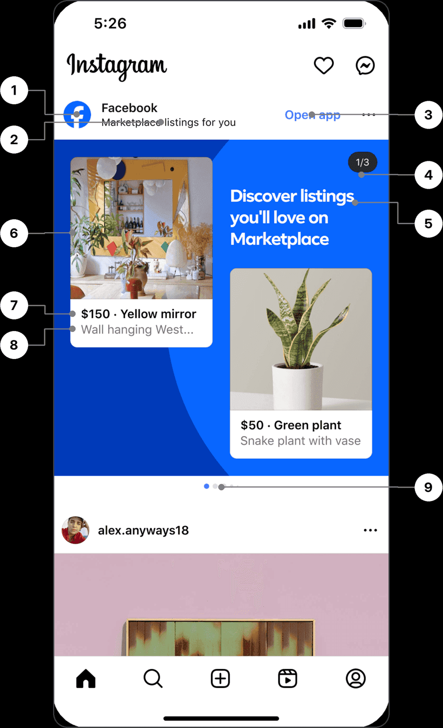
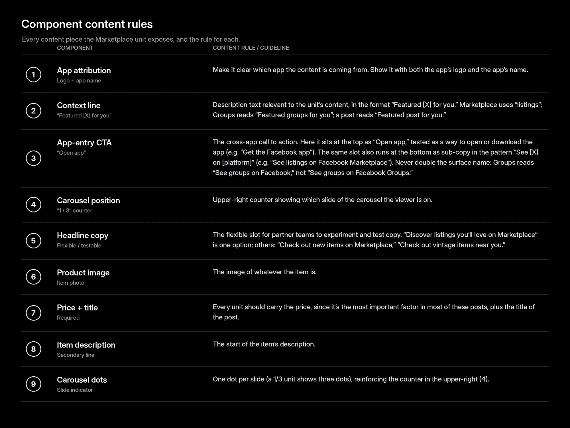
Unit Anatomy
Marketplace unit, component map
Every content piece the unit exposes, numbered to the chart below with its content rule.
Friends & family (Stories)
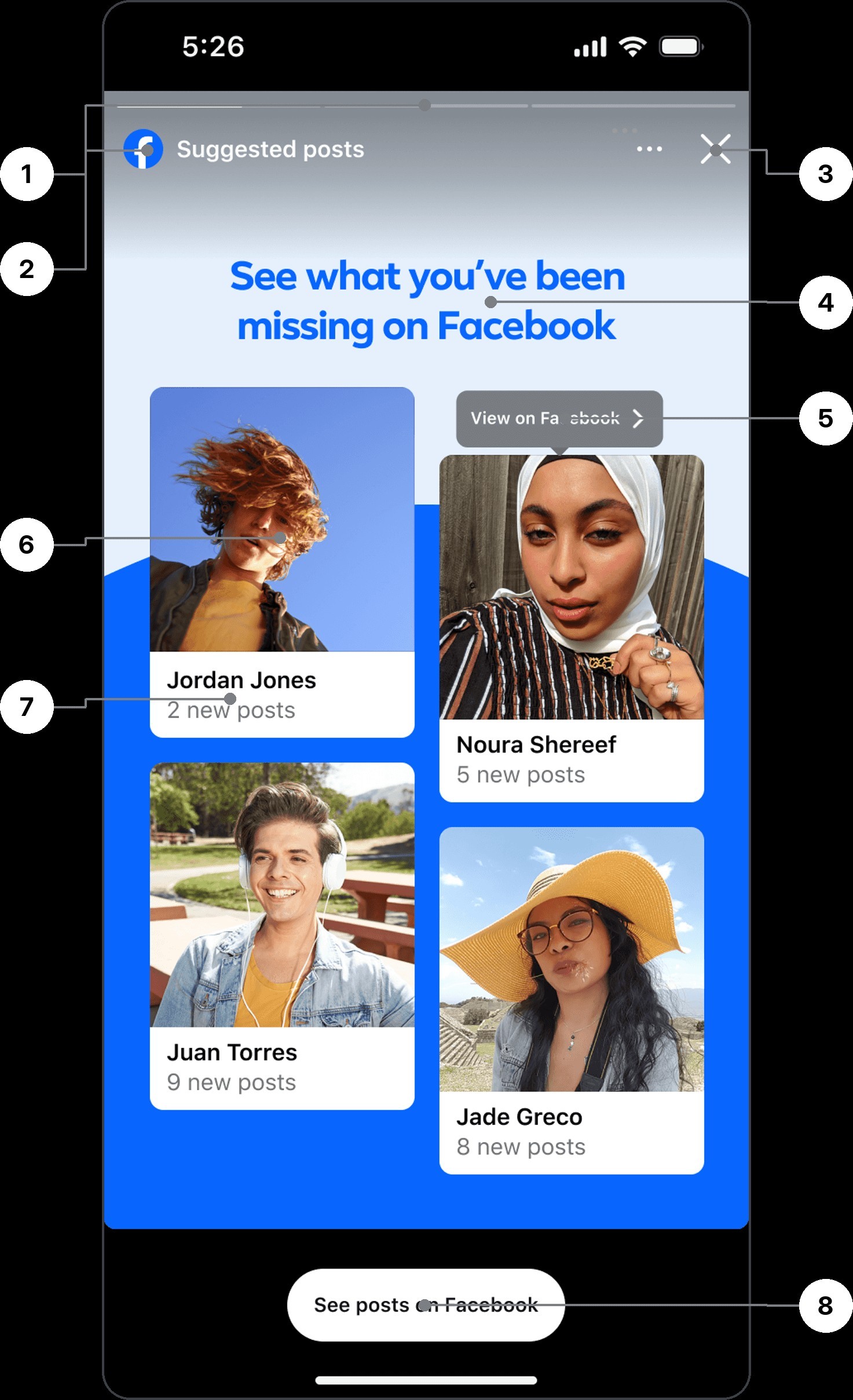
A full-screen Stories unit titled “See what you’ve been missing on Facebook.” It surfaces four friends in a staggered card grid (name plus a “N new posts” line each), with a “See posts on Facebook” pill CTA at the bottom and a per-card “View on Facebook” affordance.

Design Test Variables
While shaping the Marketplace unit, I ran a series of A/B tests on its core layout variables to land on the most effective, most native-feeling version. Each variable below was explored as a pair.
Card count
How many listings to surface in a single unit — trading selection against image size and a calm, premium feel.
A/B result: shipped three cards — more options on screen meant more taps and higher conversion.
Two listings
Three listings
Shipped
Price and description vs. full image
Whether each card leads with price and a description line, or with a single full-bleed product image.
A/B result: shipped price + description — clearly preferred over the single full-bleed image.

Price + description
Shipped

Full image
Card size and height (single card)
For single-listing layouts, how tall the lead card should be within the unit.
A/B result: taller cards showed no statistically significant impact — kept the shorter card.
Shorter card
Shipped

Taller card
Background color
A light, airy blue versus a deeper, higher-contrast blue behind the unit.
A/B result: background color showed no statistically significant impact — kept the darker blue.

Light blue
Dark blue
Shipped
The headline
The headline is the unit’s highest-leverage line. I shipped a single generic MVP — “Discover listings you’ll love on Marketplace” — then tested a set of generic variants. From there I moved to Jellybean, a content engine I wrote category guidelines for (tech, plants, furniture, and more) that crafts the headline in real time to match the items actually being shown.
Generic · MVP + Variants
MVP
Discover listings you’ll love on Marketplace
Your next favorite find is on Marketplace
New nearby listings, just for you
Local deals on Marketplace
Don’t miss these local finds
See what’s new on Marketplace
These listings won’t last long
Explore what’s new near you
Check out the latest listings
AI-driven · Jellybean
Furniture
Shop vintage mirrors and mid-century finds near you
Plants
Shop plants to brighten your day
Clothing
Shop vintage denim to build your look
Electronics
Shop tech deals to upgrade your setup
Camping
Shop gear for your next adventure
Power tools
Shop tools to finish the job right
How Jellybean Works
At serve time, Jellybean reads the set of listings the unit is about to show — their category, key attributes, condition, and price signals — and detects the dominant theme. It selects the guideline set written for that category and composes a headline from it on the fly, so the copy always speaks to what’s actually in front of the person instead of a fixed, generic line. When the item mix is ambiguous or confidence is low, it falls back to the vetted generic MVP.
Setting the Guidelines
Voice & verbs
Every line opens with an action verb (Shop, Discover, Explore) in second person, kept to a plain, scannable reading level.
Category lexicon
Each category carries an approved vocabulary and framing: furniture leans “vintage” and “mid-century,” plants lean “brighten,” electronics lean “upgrade” and “deals.”
Pattern
A flexible template — “Shop [what] to [why]” — keeps every headline benefit-led and consistent in shape.
Length
A hard character ceiling so the headline never spills past two lines or crowds the unit.
Truthfulness
The engine may only reference attributes actually present in the item set: no unverifiable superlatives, no price or availability claims.
Fallback & review
Low confidence or a mixed-category set drops back to the generic MVP, and every new category is spot-checked against live examples before it ships.
What performed better: three cards beat two, since more inventory on screen meant more taps, and most people never scrolled to a second page. Leading with price and a short description beat a full image. For a single card, neither height nor card color moved the numbers in a statistically significant way.
Notifications

Cross-app birthday notifications
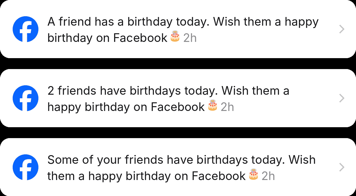
I adapted Instagram’s notification row into a birthday prompt that drives users cross-app to Facebook. Facebook owns the birthday experience, so the unit’s job is to entice the tap-through without replacing or duplicating it. For privacy and cross-app alignment, the default variants omit the birthday person’s name on Instagram, still enticing the click while leaving the reveal to Facebook. The icon is a birthday cake and the message ends in an emoji.
Celebrator · No Name (Privacy Default)
Pros
+ Safe on a cross-app surface; no identity exposed and no way to misattribute.
+ Leaves the reveal to Facebook, so it entices the tap instead of replacing the feature.
Cons
– Less personal, so lower salience.
– The user does not know who, which can soften intent to click.
Celebrator · With Name

Pros
+ Most personal and compelling; highest intent to open for a specific friend.
Cons
– Exposes a person’s identity on a different app, a privacy and cross-app concern.
– Revealing the name lets the person message the birthday friend directly on Instagram, which removes any reason to tap through to Facebook.
Celebratee · Your Birthday (Reverse / River)

Pros
+ On your own birthday, “friends are wishing you a happy birthday on Facebook” is a strong, reciprocity-driven pull.
+ Drives a big one-day spike.
Cons
– Only fires on your birthday, so it is not an evergreen driver.
– Value depends on friends actually posting.
Count Framing
Numeric (“Two friends have birthdays today”) is concrete and conveys volume, but depends on accurate counts. “Some of your friends have birthdays today” is softer and count-free, but vaguer and less urgent.
Growth notification
A higher-intent nudge to pull people cross-app, paired with the guardrail it demands.

Legal gate: geography and age
This one needs a careful hand. In places where Facebook is restricted, quietly telling someone’s friends that they post there can out them to family or the authorities, and it can tip a parent off that a grounded teen is back on social media. I gate it by region and by age, and nothing like it ships until legal has signed off.
Cross-app notification principles
The five rules that mattered most, distilled from a talk I gave to 500+ people at an internal notifications conference.
01
Avoid cannibalization
Never notify twice for the same action across both apps. If someone checks Facebook regularly, they already get birthday notifications there. Only send on Instagram if they have not opened Facebook in over a week.
02
Never push from a non-native app
You should never receive a push notification that opens Instagram only to send you to Facebook. Opening one app to be pushed into another is an awful experience.
03
Maintain app attribution
Facebook notifications should always make clear that they are coming from Facebook, with the related branding and content guidelines followed.
04
Aggregate when possible
If three friends share a birthday, do not fire three separate notifications. Bundle them into one so the tray stays calm instead of noisy.
05
Never disparage another Meta app
Never put one app down to boost another. Instagram may have more reel stickers than Facebook, but you never say the Facebook reels experience is bad, come make reels on Instagram.
Quick Promotions
A lightweight promotion that surfaces a cross-app action right on the profile — inviting people to add a WhatsApp banner so followers can reach them there. I wrote and tested the message and CTA for two audiences.

General Population

Creators

Copy variations
Headlines I explored for each audience. The shipped line leads each list in bold — the general-population framing centers on connection, while the creator cut leans into growth.
General Population
Help people connect with you on WhatsApp with a banner
Make it easier for people to connect with you on WhatsApp
Help people find you on WhatsApp with a banner
Add a WhatsApp banner so people can message you
Let people reach you on WhatsApp
Creators
Grow your network on WhatsApp by adding a banner
Get more contacts with a WhatsApp banner
Turn followers into WhatsApp contacts
Grow your WhatsApp community with a banner
Reach your audience directly on WhatsApp
Landing pages
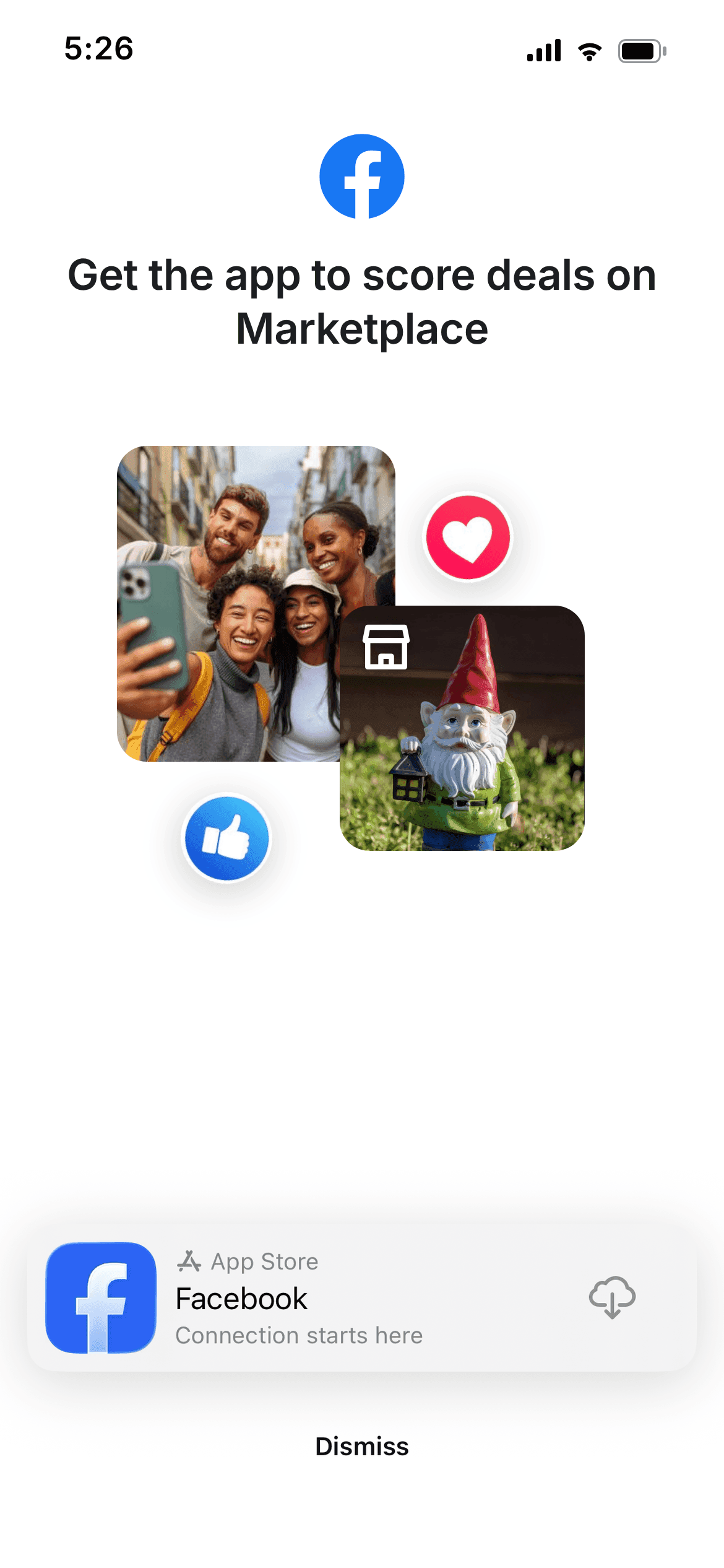
When someone taps “Join Facebook” — or any Facebook content — without an account, an install landing page hands them off to the App Store. I shipped two variants: a generic page, and a Marketplace page that mirrors the exact item someone tapped, so the promise stays consistent from tap to download.
Facebook posts (Feed)
The widest unit in the system: a real Facebook post placed inline in the Instagram feed. The card keeps Facebook’s own post chrome — author, timestamp, reactions — while the header names the source, so the content reads as borrowed rather than native. Tapping through routes to the Facebook post.

From content to landing page
The landing page is never generic — it is built from the exact content that was tapped. Tap the DeSantis post in the Instagram feed and the post preview renders that same post, same author, same reactions, with the install prompt wrapped around it. The content carries through the handoff, so the page confirms what you came for instead of dropping you on a home screen.
Tapped Content

Post Preview

Generic
Marketplace

Post Preview
Post Preview
Props
Post (content ref) · Install prompt
Variants
Generic · Marketplace · Post preview
People you know
People you know from Instagram
A reskin of the suggestions unit for cross-app friending. Instead of “Suggested for you,” the header reads “People you know from Instagram,” surfacing people you follow or are followed by, ordered by descending closeness on Facebook. I tested the call to action and how much social proof to show.
Mutual Count

Relevance Line

CTA Tested
View profile over Add friend
Pros
+ “View profile” is a low-commitment tap, so more people take it, then add the person afterward, a lower-intent path that converted better.
Cons
– “Add friend” asks for commitment up front, so it drew fewer taps and performed worse in testing.
Social Proof
Which proof to show
Pros
+ A mutual count, and then a face pile on top of it, builds trust and lifts conversion; faces make the connection feel real.
Cons
– Every extra layer of proof adds visual load and surfaces more relationship data, so the line has to earn its place.
Mutual Count

Relevance Line
People Card
Props
Name · Avatar · Proof line · CTA label
Variants
Mutual count · Relevance line
ML / AI-powered relevance

The system surfaces the highest-signal commonality per person. Examples: “Went to Harvard,” “Listens to The Strokes,” “Lives in Boston,” “Likes the Red Sox” — school, music, location, teams, and more.
Reels
Cross-App Reel
The reel unit brings Facebook-native reels into the Instagram surface. I chose to surface only reels that were created on Facebook and never cross-posted to Instagram, so the row is a real reason to cross over rather than a rerun of the feed the person is already scrolling.

The header leads with the source. ‘Suggested from Facebook’ names where the content lives, and ‘New reels’ sets the expectation of something fresh. Each cover carries a Facebook attribution so the cross-app origin is never ambiguous.
Header copy variants
The same unit can be framed a few different ways. Each variant leads with the cross-app value, that these reels live on Facebook, while trading off between discovery, novelty, and exclusivity. The variant marked ‘MVP variant’ is the one I shipped.

I also tested this unit as a full-screen Stories placement. Brand and legal asked me to keep “Facebook” in the headline itself, so viewers always knew the content was from Facebook, not Instagram.
Special promotions
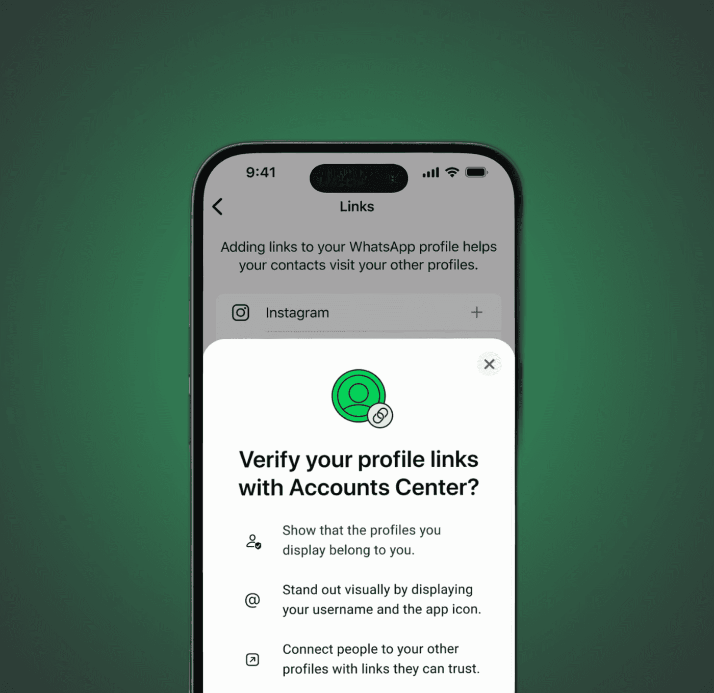
Some cross-app moments are one-offs that need a Story rather than a standing unit — the release of WhatsApp usernames is the example here.
The promo ran as a cross-app Story ad, three skippable frames introducing usernames and Meta account linking. Tapping through hands people to WhatsApp, where they reserve a username by pulling one from a linked Instagram or Facebook account.
WhatsApp usernames, in Stories
The cross-app promo, recreated frame for frame from the shipped Story ad.

The WhatsApp-side flow
Where the Story hands off: the real reservation flow, captured screen by screen.

Governance and rules
The components were the easy half. The rules are what let teams outside mine ship units I never reviewed, without the system drifting.
01
Name the source
“Facebook” stays in the header on every unit. Brand and legal both required it, so a viewer always knows the content is not Instagram’s.
02
Inherit the host surface
Type, spacing and radius come from the surface the unit sits in. Only the marque and the action colour come from Facebook.
03
One action per unit
Every unit resolves to a single cross-app action, and the CTA is the lowest-commitment version that still completes the journey.
04
Content carries through
A tapped unit lands on a page rendering that same content. Dropping someone on a generic home screen breaks the promise the unit made.
05
Headlines follow the pattern
“Shop [what] to [why]” — benefit-led, under a hard character ceiling, and human-reviewed before ship even when generated.
06
Proof is earned
Social proof escalates only as far as the relationship supports. More proof lifts conversion but adds visual load and exposes more.
07
Accessibility is a gate
Every unit ships with screen-reader labels and meets contrast on both the light unit surface and the dark host surface.
Results
The framework shipped across multiple partner teams at Meta. In its first rollout it drove an estimated +3M monthly active users across Facebook and Instagram and +1M for WhatsApp — early figures I expect to grow as the cross-app campaign scales out.
The bigger outcome is durable. Beyond the immediate lift, this work became the blueprint for future cross-app ad initiatives. As a reusable system guide, it is set to compound into far greater MAU and DAU over time than any single launch could on its own.
Impact at scale
In the US, the program was built around a first-half goal of 2 million monthly active people. Scaled across Instagram’s 3 billion global monthly actives, the same funnel projects a far larger opportunity at scale:
US Pilot
monthly actives
daily actives
Global Projected
monthly actives
daily actives
US figures reflect the program’s first-half goal of 2M monthly actives, with daily actives at roughly a third of that. Global is a directional projection — the US funnel scaled across Instagram’s 3 billion global monthly actives (about 18x the US base), and likely conservative where Facebook penetration runs lower than the US. Not a guarantee of production results.
What I would do differently
Two things. I spent test cycles on card height and background colour, and both came back with no statistically significant effect. Read together, the tests that moved the number were the ones that changed what the unit said and how much it offered: card count, price and description, and above all the headline. If I ran this again I would sequence tests by expected leverage and put the headline first, instead of treating four variables as equal.
The second is measurement. The real value of this system is that partner teams ship units without me, but I did not instrument adoption. I can tell you the units drove roughly 3 million monthly actives and that the framework spread across multiple partner teams. I cannot tell you how many units shipped on it, or how much design time it saved. That is the metric I would build in from day one now, because adoption is what proves a design system — a single launch does not.