SideB music application
Discipline
Product Design
Role
Solo Developer
Timeframe
1 month
Company
Personal project

Overview
If you collect vinyl, you probably know Discogs. For everyone else: it’s a website that’s been the go-to platform for buying, selling, and cataloging records for over two decades. The problem is, it feels like it. The interface is dense, the experience is purely transactional, and the sense of community is almost nonexistent. It’s a database dressed up as a marketplace, and for something as personal as music, that always felt like a missed opportunity.
Around the same time I was thinking about this, I got deep into Letterboxd, a social app for film lovers where you can log movies, write reviews, and follow friends to see what they’re watching. What struck me wasn’t just the design. It was the idea that watching a movie could become a social act. A solitary experience becomes a conversation. I kept thinking: why doesn’t something like this exist for vinyl?
Side B is my answer to that question. I wanted to build an app that treats music the way Letterboxd treats film, as something worth logging, discussing, and sharing. Discovery, listening logs, concert tracking, social reviews, and a marketplace, all in one location.
Design Approach
Side B was also a personal experiment in how to build with AI as a creative partner. From the earliest wireframes to the final code, I leaned into an AI-first workflow throughout the entire process, using Claude to help think through design decisions, generate and refine components, and work through problems in real time rather than in isolation.
What I found was that this approach changed how I work, not just how fast I work. Instead of getting stuck in the gap between an idea and its execution, I could stay in a creative flow and iterate quickly. Design and development stopped feeling like two separate phases and started feeling like one continuous conversation.
Technical Foundation
Side B is built on React Native with Expo, a framework that lets you write one codebase and deploy it to iOS and Android. Expo was the right starting point for this project because it handles a lot of the infrastructure that would otherwise slow down a solo developer: the build system, native device APIs, routing, and more are all configured out of the box. That meant I could spend my time on the actual product rather than wrestling with setup.
The app is structured using Expo Router, which brings file-based navigation to React Native the same way Next.js does for the web. Each screen lives in its own file and the routing just works, which kept the codebase clean and easy to reason about as the app grew.
One of the more unconventional parts of the stack is how Claude is woven into the development process itself. Rather than using a separate design tool or writing code from scratch, the entire app was built through a back-and-forth conversation with Claude in Cowork mode. Screens were described, built, reviewed, and revised in real time.
Design
The Name
SideB takes its name from a piece of vinyl vocabulary that every collector knows. On a record, the B side are the tracks that didn’t make the single, the ones that got less airplay and less attention. For serious listeners, the B side is often where the most interesting music lives. It felt like the right name for an app built around that same kind of curiosity. The users SideB is made for aren’t passive listeners.

The Logo
The concept came from a simple observation: the letter B is made of two bumps, and a vinyl record is a circle. Slice two records in half and stack them and you have a B.
I brought the idea to Claude and asked for an initial concept. The first version came back detailed and literal, with realistic vinyl records, grooves, center labels, and a tagline. It had personality but felt more like a music blog than an app icon.
From there I pushed toward something cleaner. Simpler shapes, modern typeface, less detail. The kind of logo that works at any size.
Core Features
Here are the major features present within the app.

Discovery
Discovery is the starting point. Users can browse by genre, decade, and release date, explore curated rows like Most Popular and the SideB Top 500, and get personalized recommendations from Disco, the app’s AI music assistant.

Reviews
Reviews are the social heart of the app. Users can log what they’ve been listening to, write reviews, rate albums, and see what friends have been spinning. Your own logs sit alongside your reviews as a personal history of your listening, while the social feed surfaces activity from people you follow. It’s the Letterboxd-inspired core of the experience, turning something private into something shared.

Concerts
Concerts covers the live music side of collecting. Users can browse upcoming shows, log concerts they’ve attended, and track artists they want to see. It connects the record collection to the live experience in a way no other vinyl app does.

Marketplace
The Marketplace is where the buying and selling happens. Users can browse listings, save items to a wishlist, and manage a cart, bringing the trading functionality of Discogs into the same app where you’re already discovering and logging music.
Basic Structure
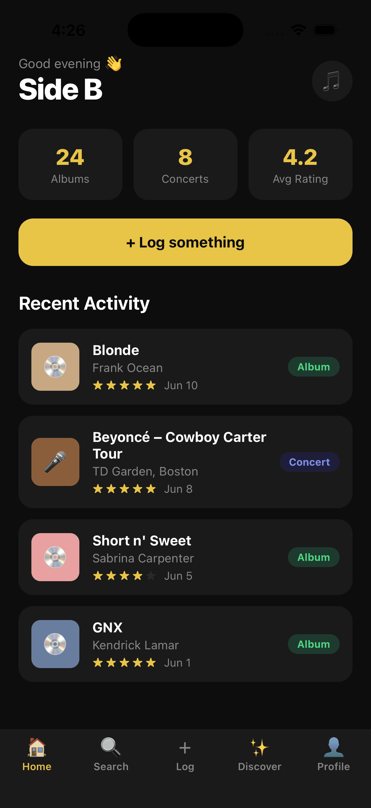
Before any real data or polish, the first step was mapping out the core structure of the app. I built out the main sections with placeholder content to establish the layout, navigation, and overall flow. Getting the skeleton in place early made it much easier to make decisions later.
Prompt Example: “Implement a persistent bottom navigation bar with 5 tabs: Home, Discover, Log, NewsFeed, and Profile. Home should have 4 sub-tabs at the top and three scrollable carousels below. Discover should include an AI chatbot widget for music recommendations, filter chips, and five curated discovery rows. The Log tab should open a modal with a three-state workflow: search, autocomplete, and a logging form with star rating, date, and review text. NewsFeed should aggregate friends’ activity into a social feed. Profile should show five favorite albums, user stats, recent activity, and a concert section.”
What came back was a working skeleton, but the visual style was blocky and outdated. Most sections had placeholder content instead of real layouts, the typography was flat, and the overall feel was closer to a basic utility app than something you’d want to use every day. It was a starting point, not a product.
But that’s exactly what it needed to be. Having something tangible to react to made the next steps much clearer.


Fonts and Basic UI
With the structure in place, I finally had the shell to start shaping my vision.
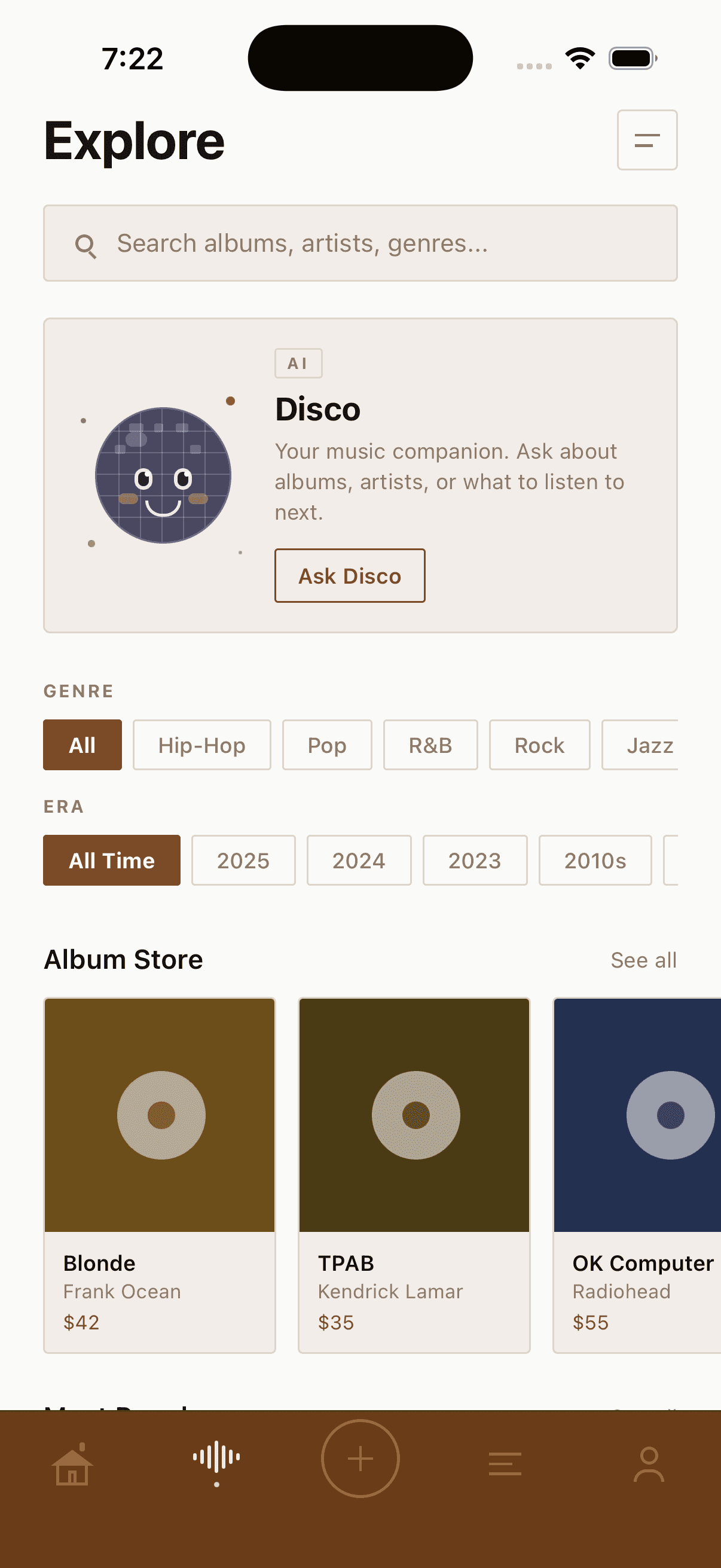
Vinyl collectors are typically nostalgic people, and I wanted the app to reflect that. The goal was a 70s aesthetic, warm, earthy, and familiar, but without feeling dated or kitschy. The solution was to combine it with a modern minimalist sensibility: something that feels reminiscent of that era but still looks like it belongs in 2026.
Prompt Examples — 1. Layout Fixes & Deletions
• Home Screen Pills (Critical): The horizontal pill components at the top of the home screen are still broken and getting cut off. Please fix the layout container, padding, or overflow settings so they are fully visible.
• Header Clean-up: Remove the “Good evening” text greeting from the top of the screen entirely. It is unnecessary.
• Profile Page Update: Remove the disc emoji from the “Albums logged” section on the profile page.
• Font Swap: Change the primary font to a clean, modern, high-contrast typeface that improves accessibility. Use Open Sans or a clean geometric sans-serif that beautifully complements a minimalist, Japanese/Zen design aesthetic.
• Discover Icon: The previous lightbulb icon looks off. Please replace it with a cleaner, more visually appealing lightbulb icon that matches the app’s overall style.
• Disco Ball Character: Redesign the disco ball icon/graphic to look like a cute, stylized character (think cozy mascot style) while maintaining a clean, Zen aesthetic.



Building out the pages
The next phase was going screen by screen and building each one out properly. Starting with the home page and working through the rest of the app.
The Home page
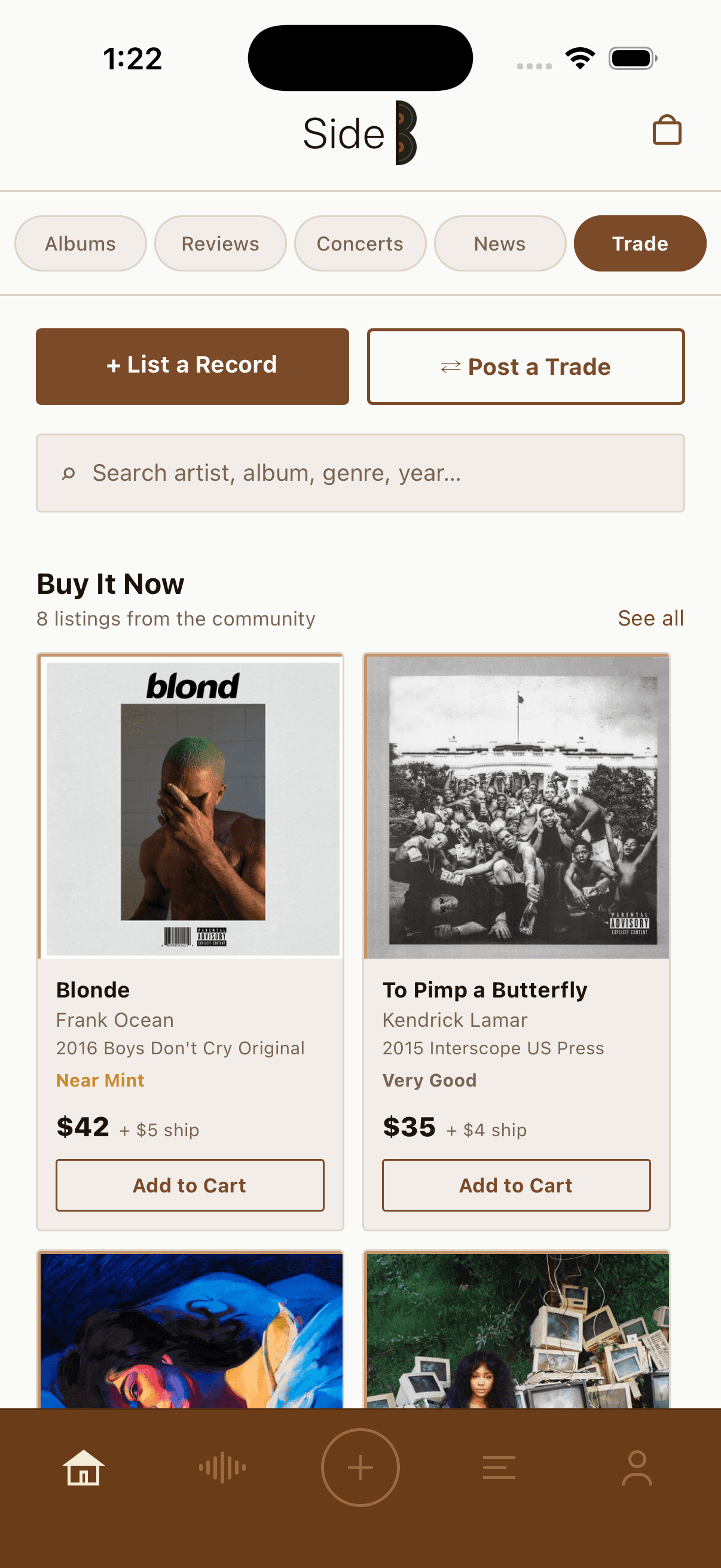
On the home page, I worked through each of the four sub-tabs: Reviews, Concerts, News, and Trade
• Reviews required a card format that could show album art, rating, and review text without the feed feeling cluttered. I also centered the logo to give the app a more symmetrical look.
• Concerts needed to balance upcoming shows with concerts you have logged, so the layout had to make both feel distinct.
• News needed to pull in content and display it in a scannable, editorial way that fit the rest of the app.
• Trade was a new addition at this stage and arguably the most complex screen in the app. Vinyl collectors are buyers and sellers by nature, and Discogs had always been the default place to handle that. The goal was to bring that functionality in-house, so users wouldn’t have to leave the app to browse listings, check prices, or make a trade.


Refining the Discovery page
The Discover tab needed the most attention coming out of the early iterations. Two problems stood out immediately.
The first was the Disco AI character. The original image generated by Claude was rough and didn’t land the way the concept deserved. A mascot-style AI assistant is a distinctive feature of the app and it needed to look the part, something charming and considered, not like a placeholder.
The second was the organization of the tab itself.
Before
After

The Disco AI character needed a higher quality, more refined look to match the personality of the app.
Alongside that, I reorganized the browsing section to make the discovery flow more intuitive, and added suggested prompts to the Disco AI widget so users landing on the screen for the first time would immediately understand how to interact with it. Although the categories were now clear the subpages were still a mess.
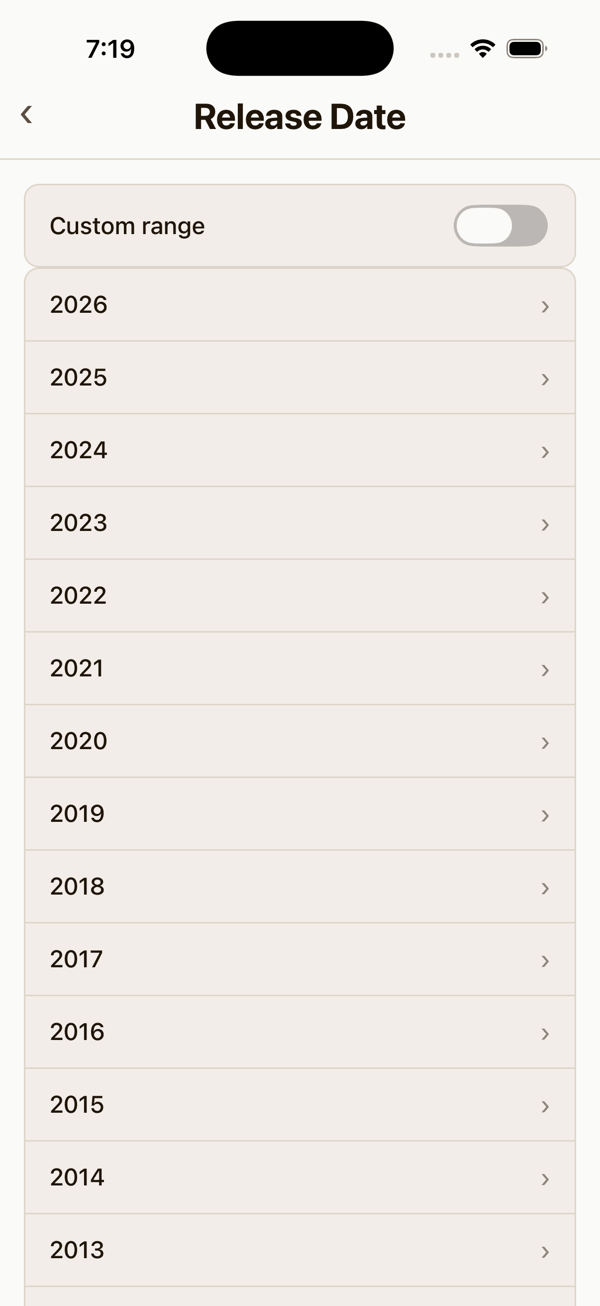
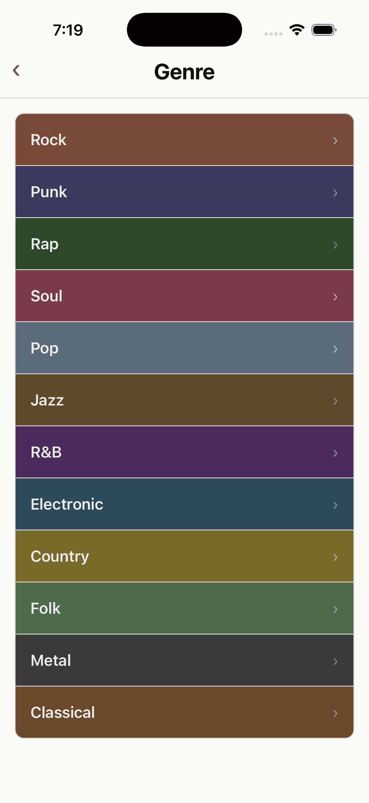


I went through and revised all the screens to have the same look and feel as the main discovery page and made some additional tweaks like adding a gap between the custom date range selector and the genre date list.


Details Pages
Tapping into a browse category opens a detail view, and the depth of that experience changes depending on where you are in the IA hierarchy. Categories like Most Popular and SideB Top 500 go straight to a results grid. Others like Genre, Decade, and Release Date first ask you to make a selection before surfacing albums.
In this early build, you may notice the log button in the center of the navigation bar. This pattern is borrowed from apps like Instagram and Camera, where the main creation action sits in the middle of the tab bar.
Category Page

Details Page

Log Page
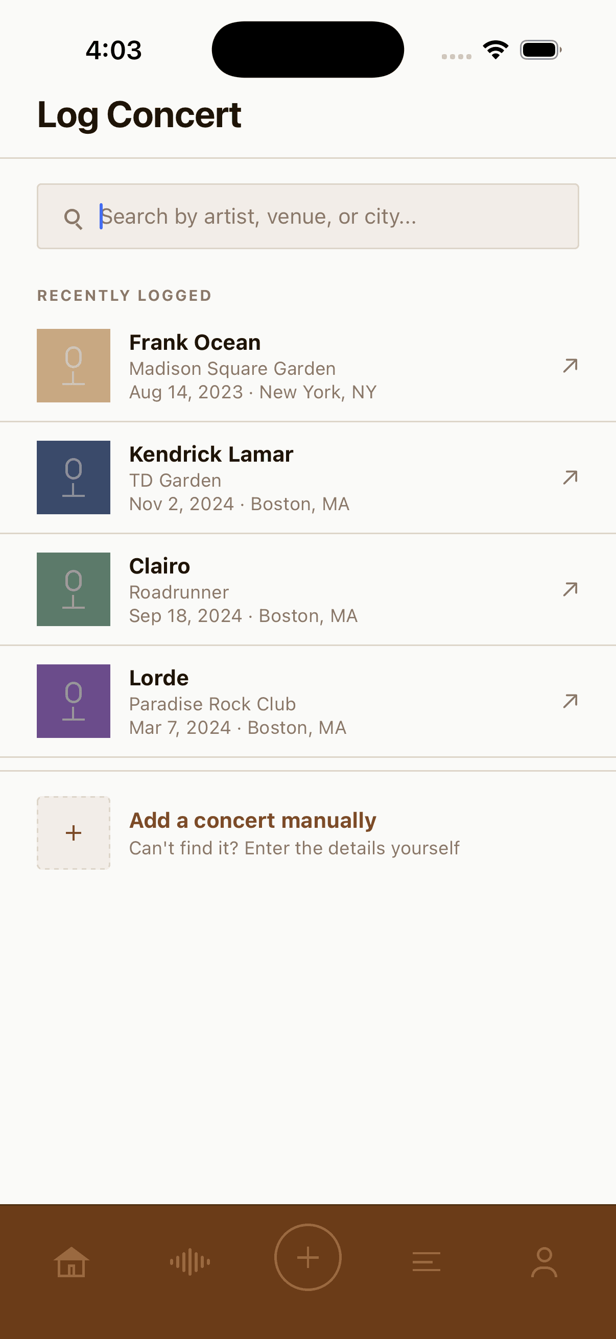
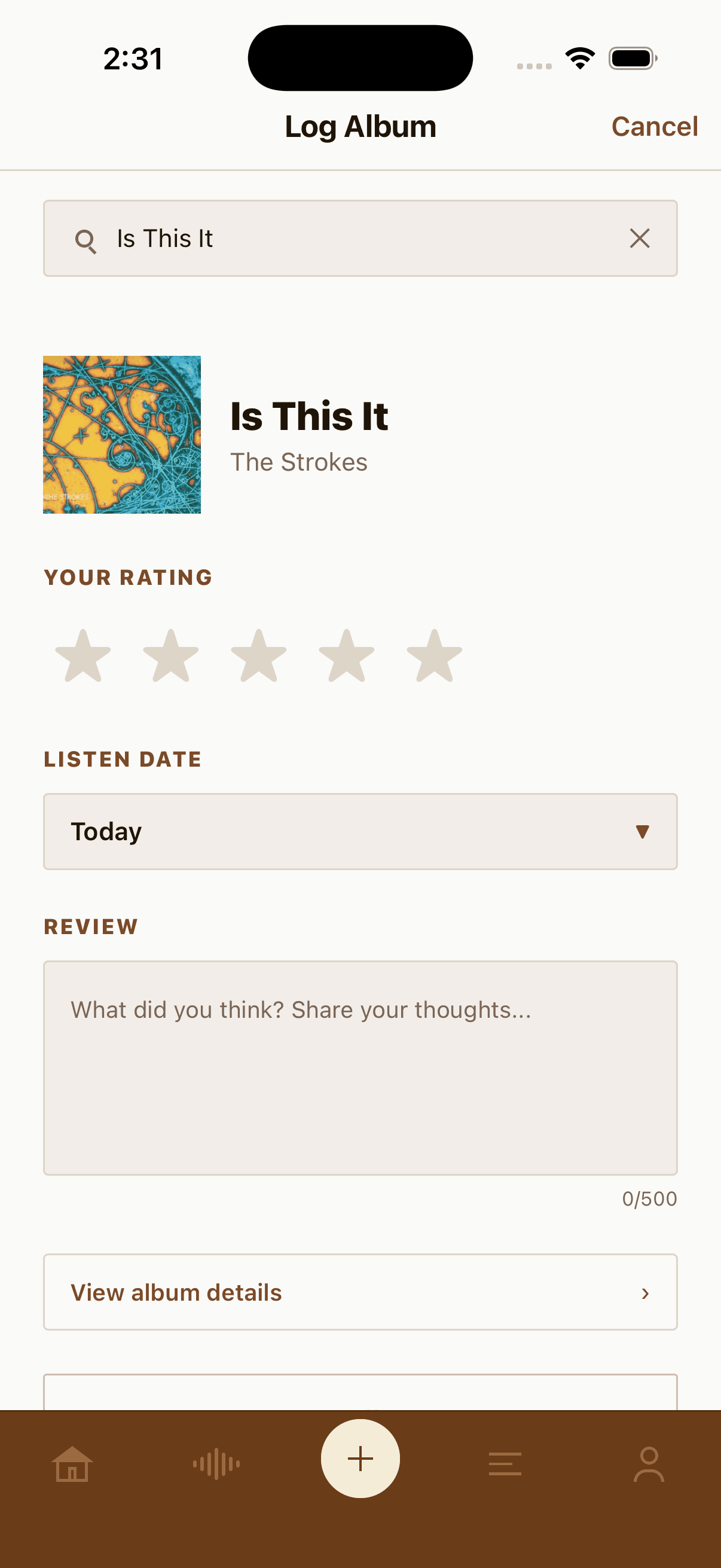
Logging albums and concerts lives at the center of the tab bar, borrowing the create-in-the-middle pattern from apps like Instagram. Tapping it opens a modal with a simple three-state flow: search for what you want to log, pick the match, then fill out the details.


Feed page
The feed page was original generated as one page that did not have sub-categories. Which did not provide any way of sorting through comments that were from others your own or about you. It also has a “colored tier system” that wasn’t being utilized and could easily be removed.

The Feed page mirrors the sub-menu style introduced on the home page. The Feed screen has three tabs:
• Friends shows reviews posted by people you follow.
• You is a personal diary of every album you have reviewed.
• Notifications surfaces activity on your reviews and comments, such as likes and replies from other users.


Profile Page
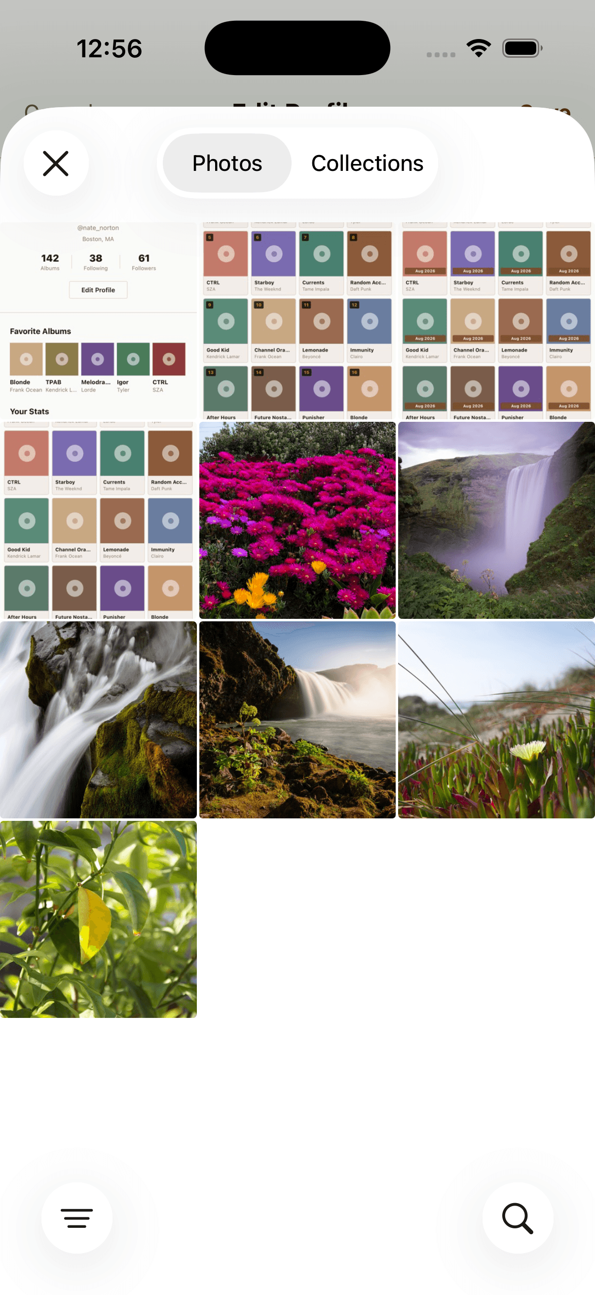
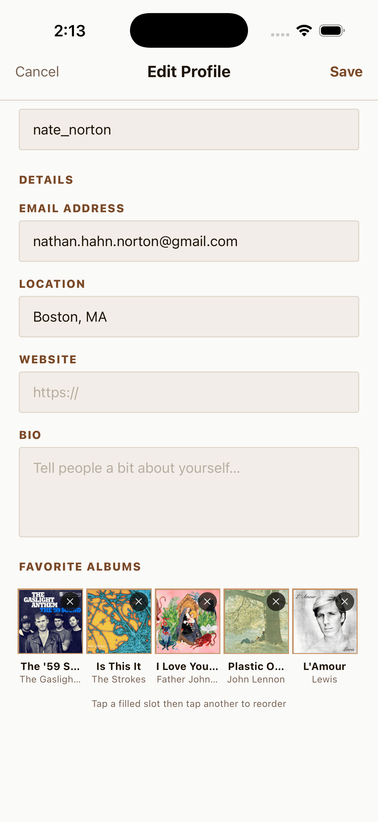
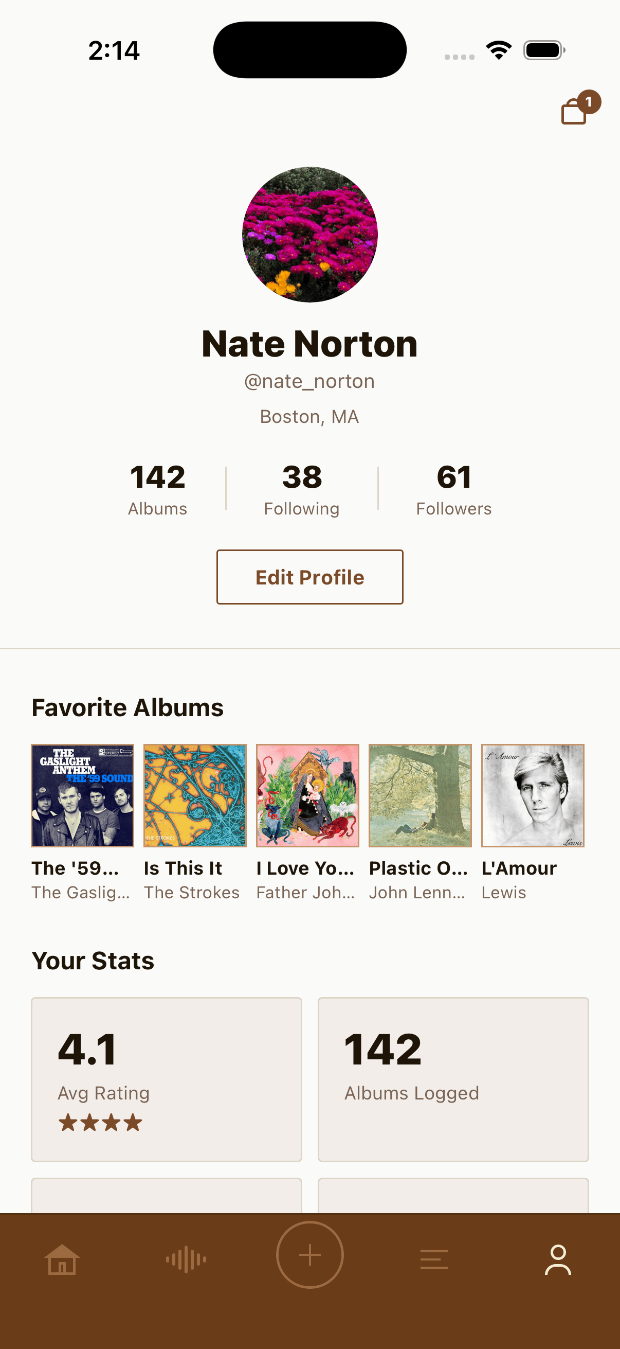
Building out the profile page I made it so users can edit their bio and select 5 of their favorite albums. At first you were only able to change your avatars color but I went back to work to make it so you can actually upload any image that you like.



Deezer API Integration
Side B uses the Deezer API to power its core content. Deezer is a public music catalog API that requires no authentication for read operations, which kept the implementation lightweight during the prototype phase.
When a user searches for an album or artist, the app queries Deezer’s search endpoint and renders the results directly into the browse grid, the album grid tiles, list rows on the Browse screen, and the album detail page. Cover art loads directly from Deezer’s CDN as remote image URLs, with no file storage needed on our end.
The API choice was deliberate for the MVP. The no-auth requirement meant zero backend infrastructure at launch. The app calls the API client-side directly from the React Native layer, so there is no intermediary server. This kept the prototype fast to build and iterate on, while still delivering a fully data-driven content experience. Rate limiting and API key security are on the roadmap ahead of any production release.



Gemini API Integration
Disco is powered by Google’s Gemini API. When a user sends a message, the app makes a direct POST request to Google’s generateContent endpoint from the React Native layer. No backend server required.
The request sends two things: a system instruction and the full conversation history. The system instruction is what gives Disco its personality. It tells Gemini to act as a 70s-themed music companion, use specific slang, and refuse to answer anything outside of albums and concerts. This keeps the AI on-brand and scoped to the app’s purpose regardless of what the user asks.
The conversation history is passed as an array of turns, alternating between user and model messages. This is what allows Disco to remember context across the conversation.

Tapping “Ask Disco” opens a chat window.

Disco will open the conversation for what you can ask

Disco has its own 1970s themed personality.

Disco provides a formatted answer.
Additional Functionality
After incorporating the APIs I expanded some of the functionality of the the features including the shopping experience, profile management, loading animation and adding reviews.
Shopping
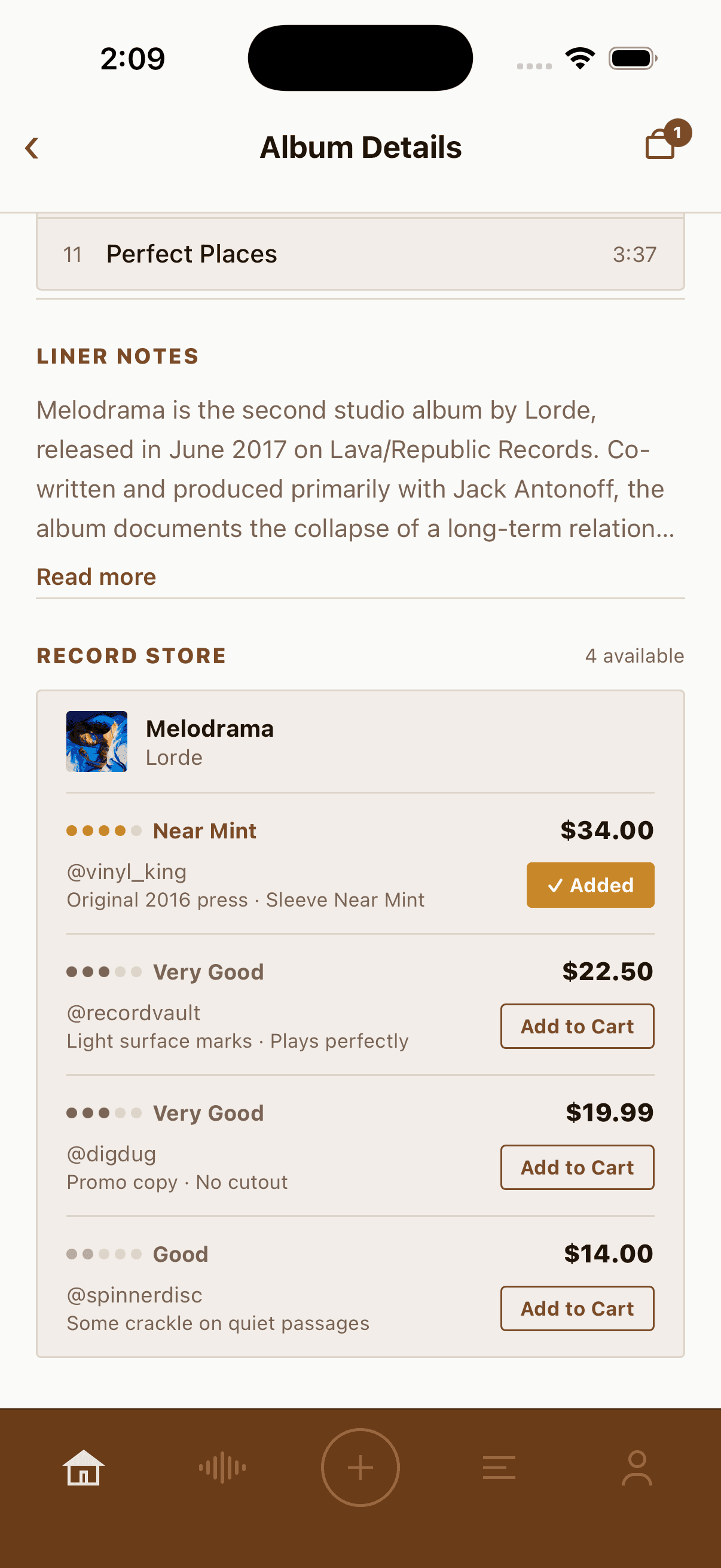
The shopping feature is functional. Users can add records to their shopping bags and complete the checkout flow.


Favorite Albums
Your five favorite albums display your profile, acting as a musical identity card for other users.
Setting them up is handled through a search flow powered by the Deezer API. Tap an empty slot and a search sheet appears. As you type an album or artist name, the app queries Deezer’s search endpoint in real time and returns matching results with cover art pulled directly from Deezer’s CDN. Tap a result and it locks into that slot on your profile.
The result is a row of five album covers that together read as a snapshot of a user’s taste.



Loading Screen
Through multiple rounds of iteration and prompting, I built an animated vinyl loading screen that appears when switching between categories.
Logging a Review
When a user logs an album, they fill out a short form: album title, artist, a star rating, and an optional written review. Once submitted, the entry gets added to their personal diary and surfaces in the Friends feed for anyone following them.




Prototype
Next Steps
User Testing
The most immediate priority is getting the app in front of real users. Recruiting vinyl collectors and music enthusiasts to walk through the core flows would surface friction points that are invisible after spending this much time inside the product. Key areas to observe: how naturally users find the log flow, whether the trade and marketplace section reads clearly on first use, and how the social feed lands with people who don’t already know what the app does.
News API Integration
The news section currently runs on hardcoded articles. Connecting to a live news API such as NewsAPI.org would let the feed pull real music headlines from sources like Pitchfork, Rolling Stone, and NME, filtered by keyword so only relevant content surfaces. This would make the app feel alive between sessions.
Concert API Integration
The upcoming shows section is seeded with placeholder data. Integrating the SeatGeek API would populate it with real local events, enable city-based filtering, and open the door to an affiliate ticket link model where the app earns a share of purchases.
User Authentication
Right now the profile is a single hardcoded user. Real accounts would unlock the full social layer: following other collectors, seeing a personalized Friends feed, and building a review history that persists across sessions and devices.
Push Notifications
Notifications would close the loop on the social features. Alerts when a friend logs a review, when someone likes or comments on yours, or when an album on your wishlist gets listed in the marketplace would bring users back to the app between active sessions.
Wishlist Making
The wishlist feature could be extended to automatically notify users when a record they have saved appears as a new marketplace listing, turning passive wishlisting into an active discovery tool for collectors hunting specific pressings.
Key Learnings
Prompting is a design skill
Getting useful output from an AI required the same clarity of thinking as writing a good brief. Vague prompts produced vague results. The more precisely I could describe a component, a behavior, or a visual rule, the closer the first output was to what I actually wanted. Learning to prompt well turned out to be as important as knowing what I wanted to build.
Iteration speed changes what you’re willing to try
Because the cost of a bad idea was a single prompt rather than hours of work, I experimented more freely than I would have in a traditional build process. Features that I might have cut from scope out of caution got built and tested in minutes. Some of them became central parts of the app.
Real APIs make a prototype feel real
Swapping placeholder data for live Deezer results changed how the app felt to use almost immediately. Real album covers, real artist names, and real search results created a sense of credibility that no amount of polished static design could replicate. It also exposed edge cases that only show up when the data is unpredictable.
Design system decisions compound
The early choice to lock in a color palette, button style, and type scale paid off every time a new screen got added. Consistency across surfaces was mostly free because the rules were already decided. The sessions where I deviated from those rules created the most cleanup work later.
Building something is the fastest way to find the gaps
Several features that seemed simple on paper turned out to be more nuanced in practice. The social feed, the log flow, and the marketplace each raised questions about information hierarchy and user intent that a wireframe alone would not have surfaced. Having a working prototype made those questions concrete and answerable.
Scope creep is a feature, not a bug
What started as a logging app grew to include a marketplace, a concert tracker, an AI companion, a news feed, and a social layer. Following those threads made the product richer and exposed new design problems worth solving. In a research context, that kind of organic expansion is valuable signal about where user interest actually lives.